Postcards from Abroad

Quanket

Postcards from Abroad
March 2018

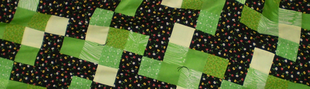
The fabric I used for the center squares is typography, some in French and some in English. I wish the photo would have done more justice to the typography, so you could better see how pretty this fabric is! While most of the fabrics were newer additions pulled from my stash – including the typography piece, the blue sashing, brown edging and the black “photo corners” – the corner block fabric was among the donated fabrics I had received from my daughter’s friend from when she worked at Center Veterinary Clinic. Don Diego was another quanket I made using fabric donated from the folks at the clinic.

When we travel, we try to send postcards back home to family and friends. This practice can be funny when traveling overseas, as many times we are home long before our postcards arrive! Nonetheless, it is fun and usually adds a bit of adventure to our travels, especially when we need to find the postal service in a country where we don’t speak the language. The earliest known picture postcard dates to 1840 and was a hand-painted design of Post Office workers seated around an enormous inkwell. It was posted in London (Fulham) by the writer Theodore Hook Esq. to himself, and is thought to have been a practical joke on the postal service.

I like how the fabric colors in the quilt go so well with my two prints hanging on the wall behind. The prints are actually paper samples from the French Paper Company, and I have six altogether. The French Paper Company is based in Niles, Michigan and is one of the last American, small, independent paper mills. They were established in 1871 and since 1922 they have used 100% renewable electricity generated by their own green hydroelectric plant (saving over one million barrels of fossil fuels to date). As a proponent of reduce/reuse/recycle, this is awesome!

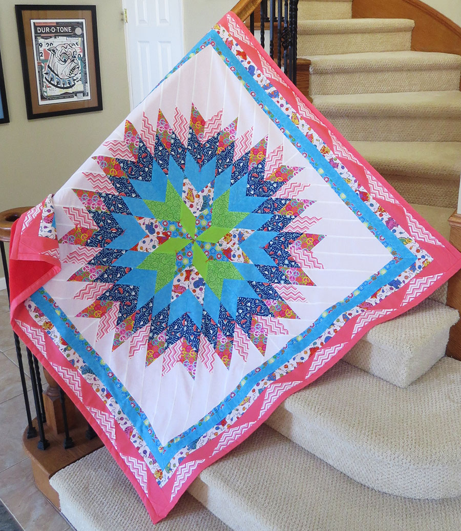
This quilt was donated to the County of Ventura, Children & Family Services, for a child in foster care in April 2018.

Catnip

Catnip
March 2018

My plan for this started out as a Lone Star quilt, but somewhere along the ‘quilt wall’, it turned into this. Basically, I opted to not give it points. I also broke my personal rule of avoiding white as a background color because it seemed that whatever other color I tried in place of the white just fell flat. And oh my, the white gives the center such great contrast that it screamed for the rule to be broken!

Why the name Catnip? I chose it for a variety of reasons. The cat fabric is sort of psychedelic, which I wonder if cats experience when they are partaking in the ‘nip’ 🙂 The cat fabric was a donation from Barb, who had acquired the fabric when her daughter passed away from cancer (#CancerSucks). The peace symbol fabric and the first blue/teal border fabric (also in the center of the star), sort of fit with the psychedelic catnip theme going on here – both having a very 60’s vibe. These two fabrics were donations from Mary, who absolutely loves cats! I chose the other fabrics from my stash to complement the overall color scheme.

I had considered naming this one ‘Frog’ for all the seam ripping I did (rip-it, rip-it) to get everything just the way I wanted it! While I want my quilts to look good, I try to balance the need to be perfect with the need to be done: the more quilts I get done, the more I can donate to foster kids. As I quilt, I try to keep in mind the quote, “Perfection is the enemy of done”. Deep Patel wrote a good article for Forbes last summer, that includes the passage:

Effective work is about moving toward the desired destination, and not necessarily about ensuring that nothing gets spilled or knocked over in the process. Mistakes will happen. Missteps will occur. It’s momentum that matters, and ensuring that time is not wasted obsessing over the little things that won’t end up moving the needle anyway.

I love the last part about moving the needle – how apropos!

This was donated to the County of Ventura, Children & Family Services, for a foster child in April 2018.